
Sunday, 18 January 2015
Saturday, 17 January 2015
MAGAZINE PLAN - HAND DRAWN DESIGNS
I have drawn two different designs for my front cover, this is because I was originally going to have the second pictures design with 3 models on the front, however this became difficult and therefore I redesigned my front cover to only have one model on the front which allows more space for cover lines.


Sunday, 11 January 2015
Second Photoshoot Make Up
Before my photo shoot I tested the make up that would be used during my photo shoot (shown in the images below) The models either had thick eye liner and dark lipstick or eye shadow and nude lipstick. Generally women in the rock industry don't wear make up because they typically 'don't care' about their appearance, women either wear very little or no make up at all. However my models are different, my models will wear heavy make up to show that even though they do spend a lot of time on their appearance they are still able to be successful in the rock industry. This make up style makes my models look bold, rebellious and rock n roll. The models hair will also be 'messy' and low maintenance which gives them the 'i dont care bed head look' which gives the impression that they live the rock and roll life style of waking up, playing a show, then partying until they fall asleep again and then wake up and do it again.


These are the make up tools and items being used throughout my photo shoots, professional make up like MAC are being used.


Saturday, 10 January 2015
Second Photoshoot costume plan
For my second photo shoot I took pictures for my contents page and my double page spread. For these photo shoots I had three models and created my own all girl rock band. I have challenged the stereotypes of the representation of women in the rock industry. Rather than having an all girl rock band that are seen as 'masculine' I wanted my models to be dressed in a 'feminine' way. I have created a 'feminine' rock look with dresses and skirts, I am proving that women can still be successful and feminine while having a rebellious, dark, rock look. I have researched about different women in the rock industry and now that Hayley Williams has grown up she also wears 'feminine' clothing such as dresses and skirts, Hayley and her style have inspired me to create the perfect costumes shown below. However the denim jackets in costumes 1 and 2 give the looks a 'rebellious' and 'dangerous' feel to them.
MODEL 1 - COSTUME 1
MODEL 2 - COSTUME 2


MODEL 3 - COSTUME 2


MODEL 1 - COSTUME 1


MODEL 2 - COSTUME 2
MODEL 3 - COSTUME 2
Thursday, 8 January 2015
First Photoshoot make up

First Photoshoot costume plan
This is the costume used for my front cover photoshoot, i wanted the front cover costume to be simple yet feminine to show that women do care about their music in the rock industry not just their image and clothing. I wanted to show that women are just as serious about their music and creating music as men. It helps the women in my magazines audience relate to the model and look up to her because my model shows that she is confident in not wearing alot of makeup and that she does not need it to feel beautiful.


Tuesday, 6 January 2015
Location Test
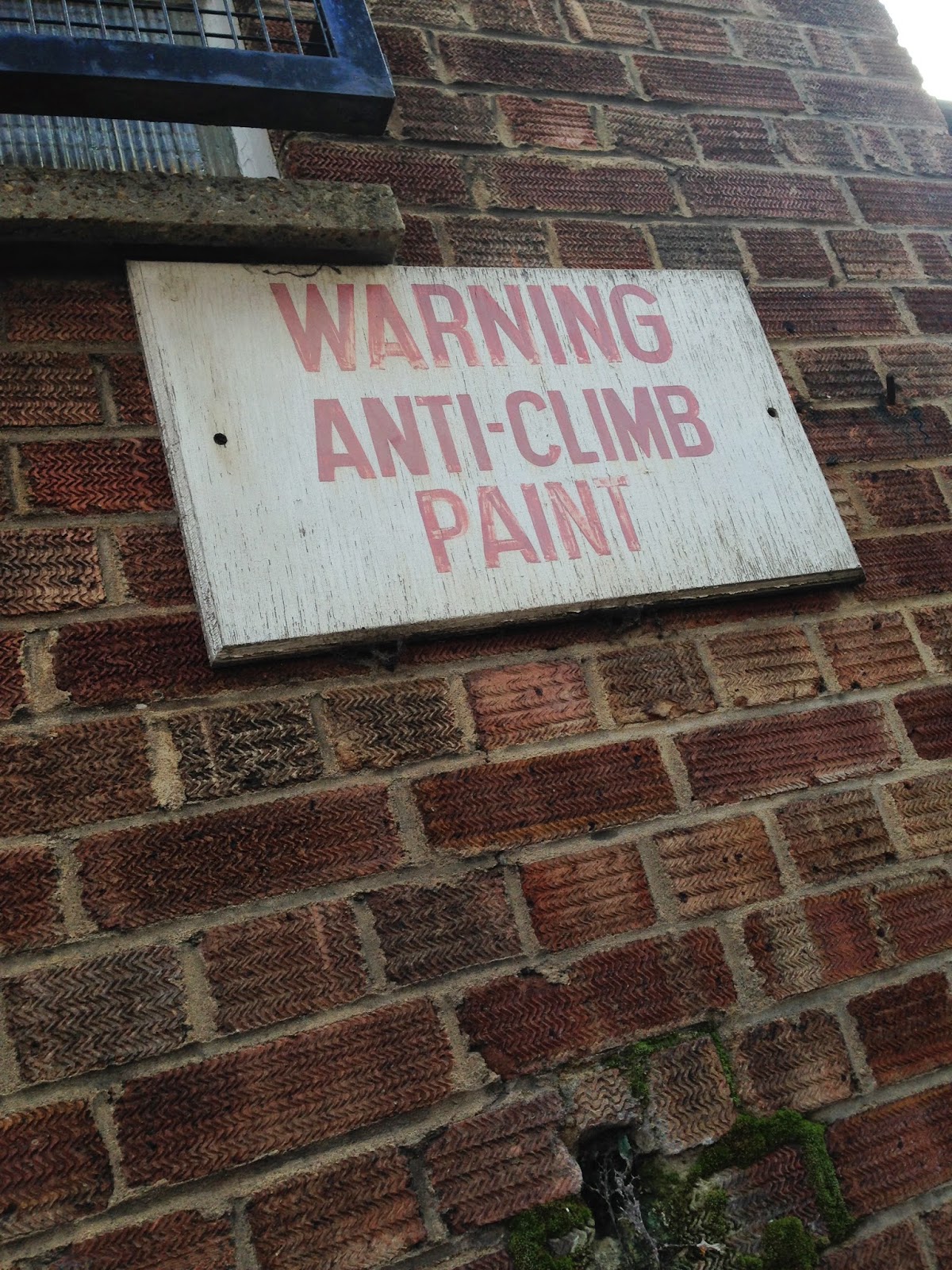
For my photo shoot I have decided that my location is ‘The Mound’ I chose this location because I thought it looked rough, rebellious and scary which is associated with rock music. I haven't been to that area before therefore I decided to test it out to see if it was actually suitable for my photo shoot and too see what features were available in the area. While looking around I had found derelict looking areas and signs such as ‘WARNING ANTI-CLIMB PAINT’ which add to the rebellious and ‘I don't care’ attitude of the models and magazine. I also found locked gates and graffiti on the signs which shows danger and rebellion. After i had tested out the location i asked one of my friends to give me feedback, they agreed that the area would be good for my magazine as it suits the style of my magazine and models.


Monday, 5 January 2015
Sunday, 4 January 2015
Location Plan
 I will have to do three different photo shoots for my magazine, this includes front cover, contents page and double page spread. I have decided I want to find abandoned and derelict areas for my contents page and double page spread because it suits the attitude of my magazine which is dangerous, scary and angry. These types of areas suit the style of the models and the genre of music, it helps achieve the grunge, rock and rebellious style and attitude I'm trying to create. Rock music is also associated with lyrics that are about being 'lonely' and 'different' just like these derelict buildings and areas.


I also enjoy going to abandoned and derelict areas myself, over the years I have visited lots of different areas in and out of London, the picture to the right is an abandoned which is actually located on my road and the car was found by me and a friend while on a walk. So from previous experiences I knew straight away where I could do my photo shoots. Which would be The Mound, in south east London, I am familiar with this location as I have visited it many times before and one of my close friends live near the mound therefore I know the best spots to take good photos for my photo shoot.

FEEDBACK:


Saturday, 3 January 2015
Research Into The Masthead of my Magazine
Below are the results to my magazine research.
Here is what a completed questionnaire looks like:


I asked my followers on different social networking sites to help me decide which masthead for my magazine would be. Instagram:


Five of my instagram followers prefer 'Amped' however nine of my instragram followers prefer 'Unplugged'
I then i asked my twitter followers:


One of my twitter followers preferred 'Amped' and two of my twitter followers preferred 'Unplugged'
I then asked my facebook friends:


One of my friends preferred 'Pause', another preferred 'unplugged' and one preferred 'Replay'
The most popular magazine name is 'Unplugged' therefore i will be using this for my magazine, one follower stated that it was 'catchy' and 'interesting' which is what i want it to be, i want to catch the readers attention as soon as they pick up the magazine. I believe 'Unplugged' is a very easy to remember therefore people are more likely to come back and buy my magazine which will make it more popular. The phrase 'Unplugged' suits my magazine well because it shows all of the artists when they aren't at a concert and 'plugged in' to their instruments, it shows what it is like behind the scenes of a crazy rock star life. It can be interpreted as when the artists are calm and aren't on stage or when they are playing acoustic instruments and taking part in interviews.
Here is what a completed questionnaire looks like:
I asked my followers on different social networking sites to help me decide which masthead for my magazine would be. Instagram:
Five of my instagram followers prefer 'Amped' however nine of my instragram followers prefer 'Unplugged'
I then i asked my twitter followers:
One of my twitter followers preferred 'Amped' and two of my twitter followers preferred 'Unplugged'
I then asked my facebook friends:
The most popular magazine name is 'Unplugged' therefore i will be using this for my magazine, one follower stated that it was 'catchy' and 'interesting' which is what i want it to be, i want to catch the readers attention as soon as they pick up the magazine. I believe 'Unplugged' is a very easy to remember therefore people are more likely to come back and buy my magazine which will make it more popular. The phrase 'Unplugged' suits my magazine well because it shows all of the artists when they aren't at a concert and 'plugged in' to their instruments, it shows what it is like behind the scenes of a crazy rock star life. It can be interpreted as when the artists are calm and aren't on stage or when they are playing acoustic instruments and taking part in interviews.
Meet My Models


I have created a three woman band for my star image because typically bands are all men or have one woman and the rest of the band are men therefore I want to challenge the typical stereotypes in the rock industry. To do this I have my three models, Elizabeth, Sian and Jess. All models are 16 years old and enjoy the rock music industry. I have chosen these three models particularly because they follow rock culture and like to idolise women such as Hayley Williams therefore they know the attitude and style to portray during the photo shoot. All models already dress in dark colours and wear thick dark make up therefore they would feel comfortable in dressing this way for my photo-shoot and would be able to come out with the best possible pictures for my magazine.
Friday, 2 January 2015
Further Research
I interviewed Kevin Webber for a more in depth view of how to make the perfect magazine
Do you think the colour scheme is particularly important when creating a magazine?
It is very important yes, as when somebody first views your magazine; colours will be a part of their overall decision on how appealing, presentable and most of all how much the magazine actually relates to the genre chosen. In my earlier questionnaire that you requested me for, I answered for you “red, black and white” in your selection of 5 answers as these are all quite high in contrast and powerful colours so in my opinion these colours would be very appealing to the eye & beneficial towards the magazine.
Is £2.50 is a suitable price for my target audience?
Well, as it’s a monthly magazine, personally i think £5 a month is hardly an expensive subscription nowadays as people are subscribing to all sorts of things are prices more than £2.50, so I wouldn't hesitate to bump up the price to at least a £5.
Do you think that my target audience would enjoy reading articles such as concert reviews or album reviews? if no please suggest others.
Personally speaking I actually am a fan of reading articles and reviews as most subjects in life that are designed and created mostly require documentation or articles to describe, and reviews of related topics to the genre so in this case (concert & albums) to see feedback and supportive information about the magazine at hand. So yes I’d enjoy reading articles & viewing concert and album reviews as I get the maximum information for the money I’m spending.
Which is better and why, releasing a magazine every week or every month?
it really depends on the subscribers and their reviews, some people like to see a more lively magazine as music is a booming industry so of course new artists and their material is constantly being released, but also at the same time some people enjoy monthly magazine articles as overall it will be packed with much more information detailing viewers on who is the top monthly occurring artists instead of weekly and the longer someone is a monthly number 1, the better they are than a weekly number 1 in my opinion.
Does the paper quality of the magazine have an impact on the overall outcome?
Well, if you think about it the colours and the picture qualities would be more much presentable on a higher quality material than if it wasn’t, so personally the clearer the quality, the more appealing and the more appealing, the more viewers and the more viewers, the more money. But obviously there is a catch to that which would be the cost would be more expensive in productivity. But if you think about it, most importantly the overall impact of the outcome of your magazine quality wise would be presented at a more professional level and so because of that reason, the money side would most likely be in your favour in my opinion.
Subscribe to:
Comments (Atom)